Art Prints for Office Walls: Size, Glare and Placement
A functional checklist for placing graphic art in workspaces without turning the wall into background noise.
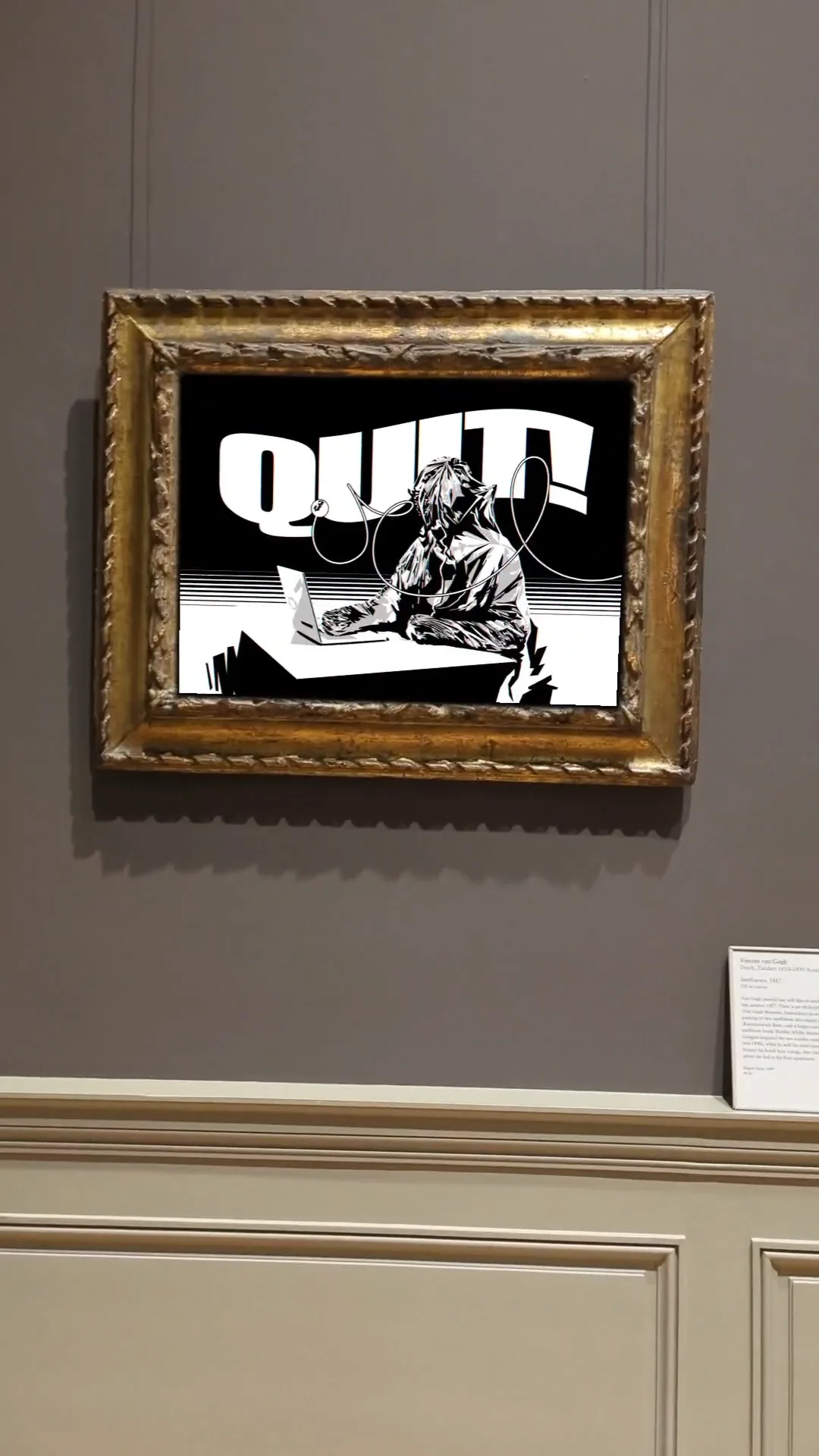
Decide whether the work is for focus or for circulation
A print behind a desk is seen repeatedly by the same person. A print in a corridor or meeting room is seen by many people for short periods. Those are different jobs. Dense work can reward repeated viewing; bolder, simpler compositions usually read faster in circulation areas.
Check screen reflections and glass
If the print is framed behind glazing, direct overhead light can create a mirror. Before fixing the position, stand where people will actually sit and look for reflections from windows and ceiling fixtures. Matte or low-reflection glazing can be worth more than a more expensive frame in a bright office.
Match scale to wall architecture
Use door heights, panel widths, desks and storage units as reference lines. A print that aligns with existing architecture looks intentional even when the artwork itself is visually aggressive.
Treat text-based work as language
If the artwork contains words, assume people will read them. In client-facing areas, choose language that the organisation is comfortable displaying every day. In private offices, the choice can be much more personal.
Leave enough air
Offices already contain screens, signage and equipment. A graphic print usually benefits from a clear zone around it. One strong work with space can read more clearly than several competing pieces.